Brightness and Contrast again is a very simple image but can have a great effect on your image. It can enhance all the colours within in the image and further bring your image to life.
Once your image is opened in Photoshop, you will need to unlock your image. Automatically your background layer will be locked. A small lock icon will appear next to your background layer to signify this. To unlock the layer, double-click the ‘locked background layer’ in the layers panel. This will change your layer from background to layer 0, you do have the option to rename your image to a different name e.g Brightness Layer.
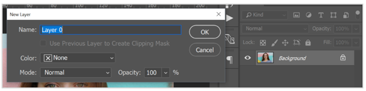
The Image is currently locked, indicated by the lock symbol in the Layers Panel. By double-clicking the image the new layer panels will appear to change the layer to ‘Layer 0’
To firstly adjust the Brightness and Contrast of this image, we will need to use the adjustment circle icon, which is located in the bottom of the layers panel. (It is a half white half black circle). 
From clicking this icon it will bring up a pop-up bar, that will have a variety of adjustment options for your image. From this particular adjustment, we will be focusing on Brightness and Contrast.
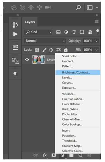
Brightness and Contrast Option in Layers Panel.
Once Brightness and Contrast has been selected a properties panel will appear for the adjustment of Brightness/ Contrast. The panel will appear with two sliders once for brightness and a separate slider for contrast. It will also come with an auto setting button. Bt selecting this button Photoshop automatically adjusts these two settings for you.
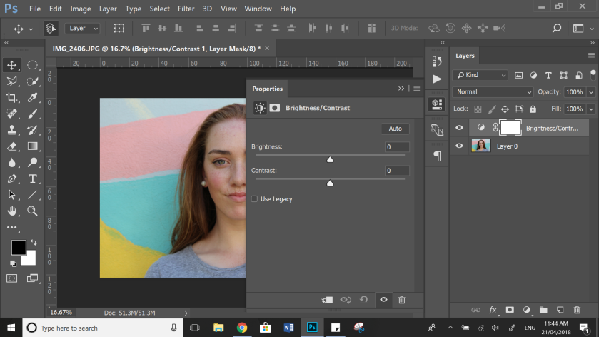
The properties panel for Brightness/Contrast.
Personally, I like to adjust these sliders manually. I find I can gain a more accurate adjustment over the auto setting. I like to focus on these adjustments separately rather than together. Firstly I adjust the brightness before the contrast. I find the brightness gives me a good starting point for the image.
It is important to remember these adjustments do not need to be dramatically big, the smallest of adjustment can make a better image rather than a big one.
With the brightness, you need to be careful of how far you move the slider. If you take the slider too far up it can white out the image. If the brightness is taken too far down it can make the image too dark. Below is an example of this:


As you can tell the left image the brightness is adjusted too high and clearly washing the image out. The right image has clearly been adjusted too low, the shadows are too dark.
With the contrast of the image, the same rules apply. The smaller the adjustments the better the image. With contrast it is important not to move the slider too high, this can make the image too intense and lose the softness of the image. This is an example of the image having a too high of a contrast level.
This image has been adjusted to a very high contrast level. This has made the image too dark and too intense.
When adjusting the brightness and contrast you need to find a balance between the two levels. It is important to continually try and improve the image but trying different levels. The trial and error process will work well in this instance.
To see a before and after of your image click the ‘eye’ icon on the bottom right side of the properties panel. TIP: If your adjustment is too harsh you can adjust the opacity. To do this use the opacity percentage above the layers panel.
Finally, once you are happier with your adjustments exit the properties bar.
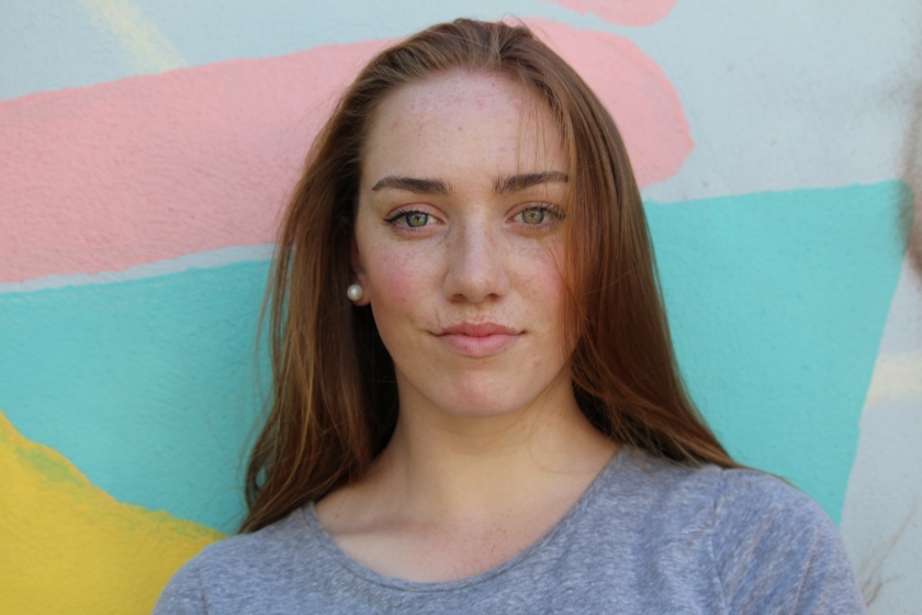
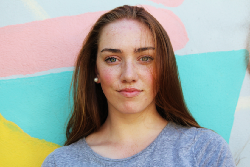
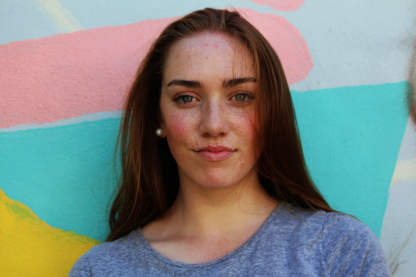
The top image is this original image before adjustments. The bottom image is after the Brightness and Contrast was adjusted.
As you can tell by the difference in both of these images, the second image has an increase of colour and vibrancy. The contrast is darkened to emphasise the colours in the wall, eyes and hair. These slight adjustments are great for the beginning of your editing process and are a great foundation for any image.
